What does a data observability dashboard look like and how does it work?
In this article, you’ll find some examples of data pipeline observability and monitoring with Snowplow BDP and open source. The graphs below are taken from our BI tool with data that is readily available to all Snowplow users. We have provided examples from both AWS and GCP.
The article is broken down into ‘monitoring’ and ‘observability’ to help illustrate how observability can become the starting point for further investigation with monitoring tools.
Learn more about the difference between monitoring and observability.
What is Snowplow Analytics?
Snowplow’s position is that high-quality data does not just ‘happen’, it is created with careful processes to ensure quality, good governance, and usefulness.
We specialize solely in the creation of behavioral data, the fundamental unit of which is ‘events’. These occur whenever someone or something interacts with a digital estate. This can be a click, a hover, a page view or any other types of interaction on websites, apps, wearables, IoT devices or digital interfaces.
Our strategy is to create one, ultra-high quality data table, which can be used as a single-source of truth for all your third party apps via reverse ETL or GTM SS. This single table forms an immutable log of every event which takes place and it grows in value over time. Part of this commitment to a single source of truth is observability, which catches issues before they can snowball.
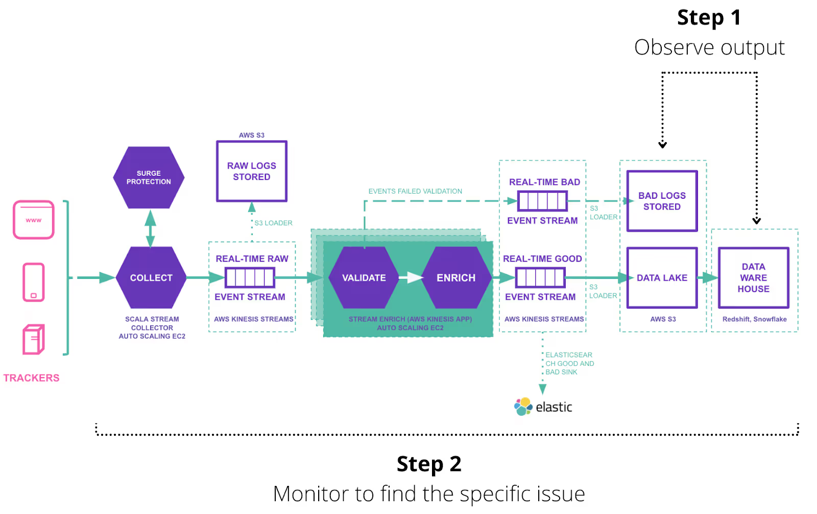
A quick overview of a Snowplow data pipeline
This schematic will provide some context when we discuss moving from observability into monitoring to detect potential issues in the pipeline.
Imagine that observability is like an omniscient eye cast over the whole pipeline. The problem with the eye is that it can’t focus enough to find issues at the most granular level.
For this reason, if we spot a higher-level problem, such as a sudden increase in latency in the event stream, monitoring would be necessary to effectively focus in on the issue. We would look at each component of the pipeline separately to see whether it is only one area that is affected and then attempt to find the root cause with a combination of technical and business-level questions.

Observability
Event volume and latency are the fundamental metrics we use to observe the health of behavioral data – telling us how much data was ingested at each stage and how fresh it is. As we briefly discussed above, this allows for a top-level view to help decide whether further investigation is necessary.
Another advantage of these simple metrics is that they can be understood by all stakeholders. This in effect enhances observability by allowing less technical parties to have a view of the overall performance of the data pipeline.
Latency and event count to warehouse (granularity: hourly)

Notice the spike around December 16. If this isn’t part of an expected weekly variance, then further analysis is likely to be necessary.

Here we extended the time range to see whether the spike is part of a regular weekly variance. We can see that it isn’t, so we decide to investigate further.
One interesting clue is that latency and volume spike at the same exact time in the first spike, which could inform the starting point of the investigation.
Here you can see daily data volumes for good and bad event streams, which includes data quality expressed as a percentage. This type of information can also offer a high-level overview of the state of the system or be cross referenced to other observability metrics.

Questions at this stage in the error-detection process
Notice the combination of business-level and technical questions. A degree of domain knowledge is definitely necessary to effectively problem solve. This is why the data team should not operate in a silo.
- 1. Why did volume spike?
- 2. Did any external/business events coincide with the spikes?
- 3. When was the latest schema released (including updated versions)?
For those who aren’t familiar with Snowplow, JSON schemas form the basis for structuring data. Data is collected and validated against a user-defined schema to create a highly-expected data structure in your warehouse. Our schema-versioning tech (schema v.1, v.2 etc.) helps maintain discoverability and observability.
- 4. Has anyone started tracking anything new?
For data teams to be effective, clear definitions and communication are essential. This goes right to the heart of data discoverability. If you struggle to find out whether new tracking has been implemented, then data collection processes might need to be reviewed.
- 5. Why did latency spike at the same time?
To answer this question, we need to dive into system monitoring. You might ask, for example: ‘Was there also a delay in the Enrich stream?’, ‘Did Surge Protection kick in?’, or ‘Was Kinesis resharding taking place?’ (AWS only).
Monitoring
So far we have covered:
- observability vs monitoring
- the importance of both for behavioral data ingestion
- the recommended starting point for observability in behavioral data ingestion
- some questions that form the starting point of an investigation using monitoring dashboards
Below you will find some examples of monitoring dashboards we use at Snowplow to act as inspiration for anyone doing behavioral data ingestion. We have found them tremendously useful in incident resolution. The metrics are key to us maintaining our very tight SLAs to our customers, and the functionality is also available to open source users.
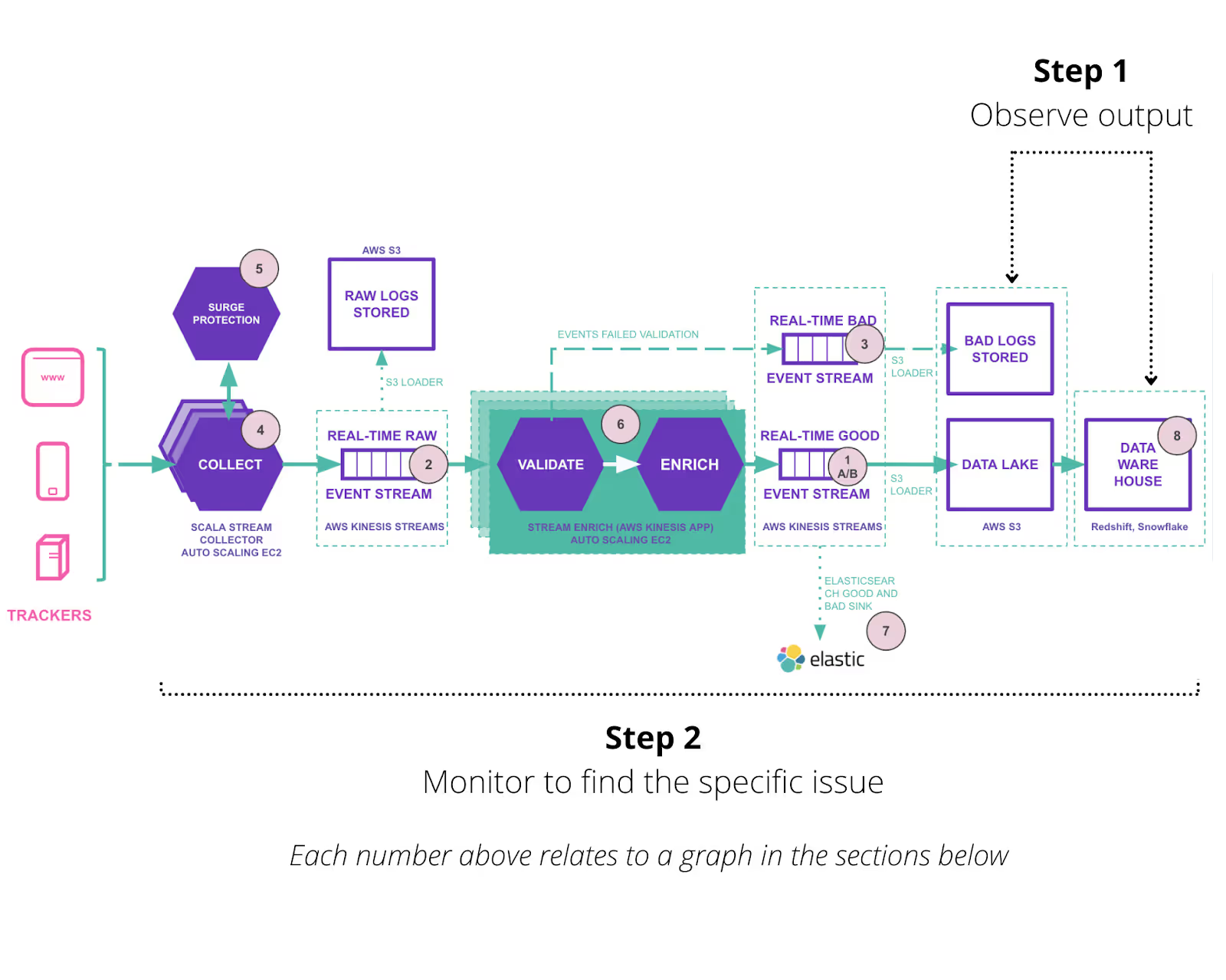
Monitoring our data pipelines is a lot like breaking apart an electrical circuit for testing. When you see a light blinking you know you need to backtrack through different steps - light switch, bulb, fuseboard - to see where the problem lies. That’s why we’ve numbered the diagram with a reference for each graph below, so you can imagine how the monitoring process might look.

Monitoring Section 1: Latency in Stream
The graphs in this section all relate to the real-time streams which you can see in the diagram above. These examples are all taken from AWS. In some cases the same graph is available in GCP, however there are some fundamental differences in data output between AWS and GCP (for example, GCP doesn’t have ‘resharding’).
1a. Good Enriched stream latency

1b. Stream Shard Count (Autoscaling)
This monitors whether resharding was taking place in AWS. Our industry-leading autoscaling tech ensures Kinesis, an expensive resource, does not need to be overprovisioned and can respond effectively to demand while maintaining low latency through to your data warehouse.

2. Raw stream latency.

3. Bad stream latency
Bad streams data is a result of Snowplow’s schema technology, which validates data against a JSON schema before it reaches the warehouse to prevent corrupting your atomic data table (the single source of truth for business decisions).

Monitoring Section 2: Applications
Again, refer to the diagram at the beginning of the Monitoring section to see which stage in the pipeline we are referring to.
CPU utilization (not indicated on the diagram)
This offers an overview of CPU usage across all apps. We can use CPU utilization to determine when to scale up the number of instances.
For example, if collectors are all running at 80% then we need to implement more collectors.

4. ALB Requests per 10m
The ALB (Application Load Balancer) is a load-balancing service that distributes the load generated by web services, preventing rapid spikes in access requests to a single collector instance. The ALB improves stability and maintains high availability by distributing the load.
Collection is an essential point in the Snowplow pipeline. We recommend having a minimum of 2 collector instances due to its criticality (a high-volume pipeline might have 10+), creating the need for a load balancer.
5. Message Distribution
In the case of sudden spikes in traffic, an SQS queue can allow time for Kinesis to reshard, this graph shows usage of the overflow queue.

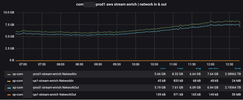
6. AWS Stream Enrich
Stream Enrich combines the jobs done at ‘Validation’ and ‘Enrichment’.
Enrichment is the stage in a Snowplow pipeline where our behavioral data can be combined with data from 3rd parties, such as weather data or transactional data from Stitch.
Validation is the stage where data is checked against pre-defined JSON schemas before entering the warehouse.

We also expose custom metrics, like ‘good and bad event counts per application’ and ‘event latency per application’ via Statsd.
Statsd is a daemon that aggregates and summarizes application metrics. It receives metrics sent by the application over UDP, and then periodically flushes the aggregated metrics to a pluggable storage backend.
7. Minimum free space and HTTP request count
This is crucial for assessing capacity when using Elasticsearch to visualize your behavioral data in real time.

Monitoring Section 3: Warehouse
While this falls outside of the Snowplow pipeline, it is an important part of the behavioral data pipeline, and closes the loop at the end of this observability/monitoring process.
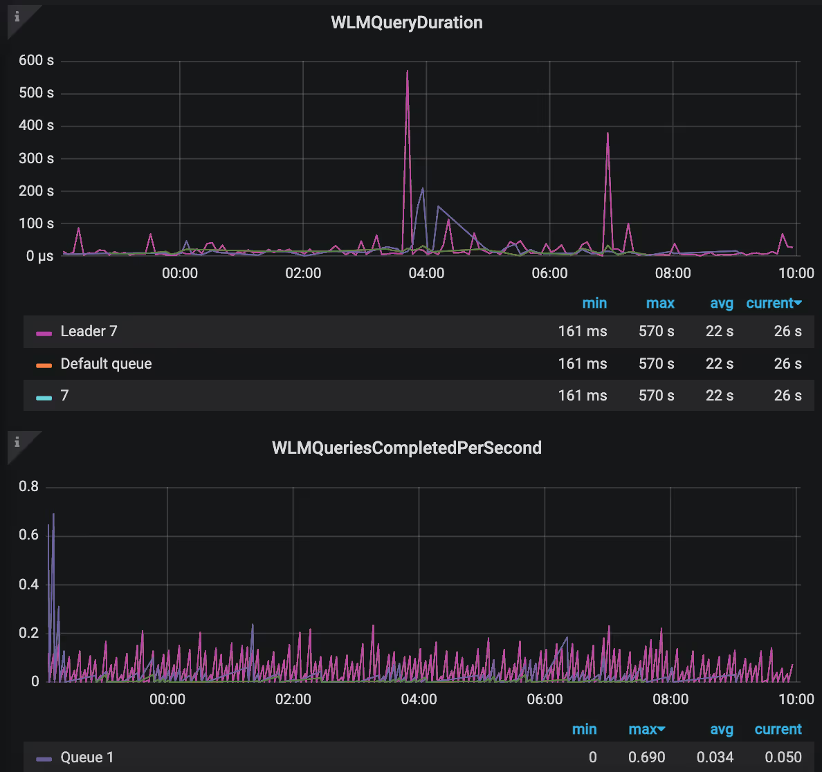
8. Queries
‘Queries’ relate to monitoring warehouse performance in Redshift.
There are many ‘query’ metrics available, so you can get a very granular view of events in your data warehouse.

Technical questions
If you have any questions about data observability, reach out to our open source community on the Snowplow Discourse.
Conclusion
This is just a small selection of the metrics you use to observe the ongoing state of your data pipeline. The questions to ask when considering whether to start an observability project are:
- What is the annual cost of data downtime?
- What is the organizational cost of poor-quality data?
- What is the overall cost of taking a reactive - rather than proactive - approach to maintaining your data pipeline? (This can be measured in various ways: service disruption, a proliferation of mundane repair tasks, as well as other inefficiencies.)
Clearly, for data-led businesses the financial and organizational costs are so large they are difficult to quantify. That’s why we believe observability should be integrated into the workflows of mature data teams as part of an ever-increasing commitment to a ‘data-as-a-product’ culture.
Never tried Snowplow and want to test this out?

