How to develop better games with level analytics
Product managers and game designers generally aim to design game levels in such a way that they challenge gamers enough to make completing a level satisfying, but not so challenging that they drop out and stop playing the game.
This blog post shows an example of how product managers and game designers can use a well designed dashboard to better understand user behaviour across a game’s levels, design highly playable game levels, A/B test and roll out changes and new features, and ultimately optimise the user experience.
This example is based on a demonstration of the Snowplow platform built for the CodeCombat coding game, which we prepared for the Game Developers Conference (GDC) in San Francisco.
Introducing the Snowplow platform
Data can be essential to a product manager’s role, but often the tools that are used are not quite fit for purpose. Snowplow Analytics offers a data pipeline management service, using our software to collect, validate, enrich and deduplicate event-level data at source and store it in your data warehouse. This means that your event data arrive at your database fully usable and fit for purpose. This is highly granular data about how your users interact with your product and marketing channels. Our analytics team can also help model the data once it has been processed, to ensure that it is easy to use and in the right format.
The GDC demo: dashboard
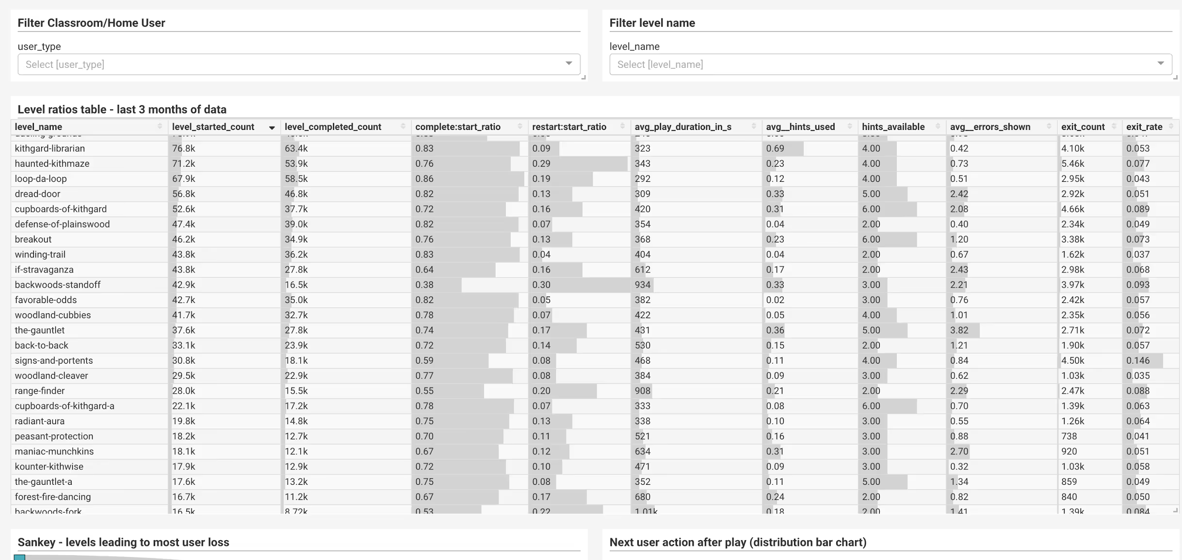
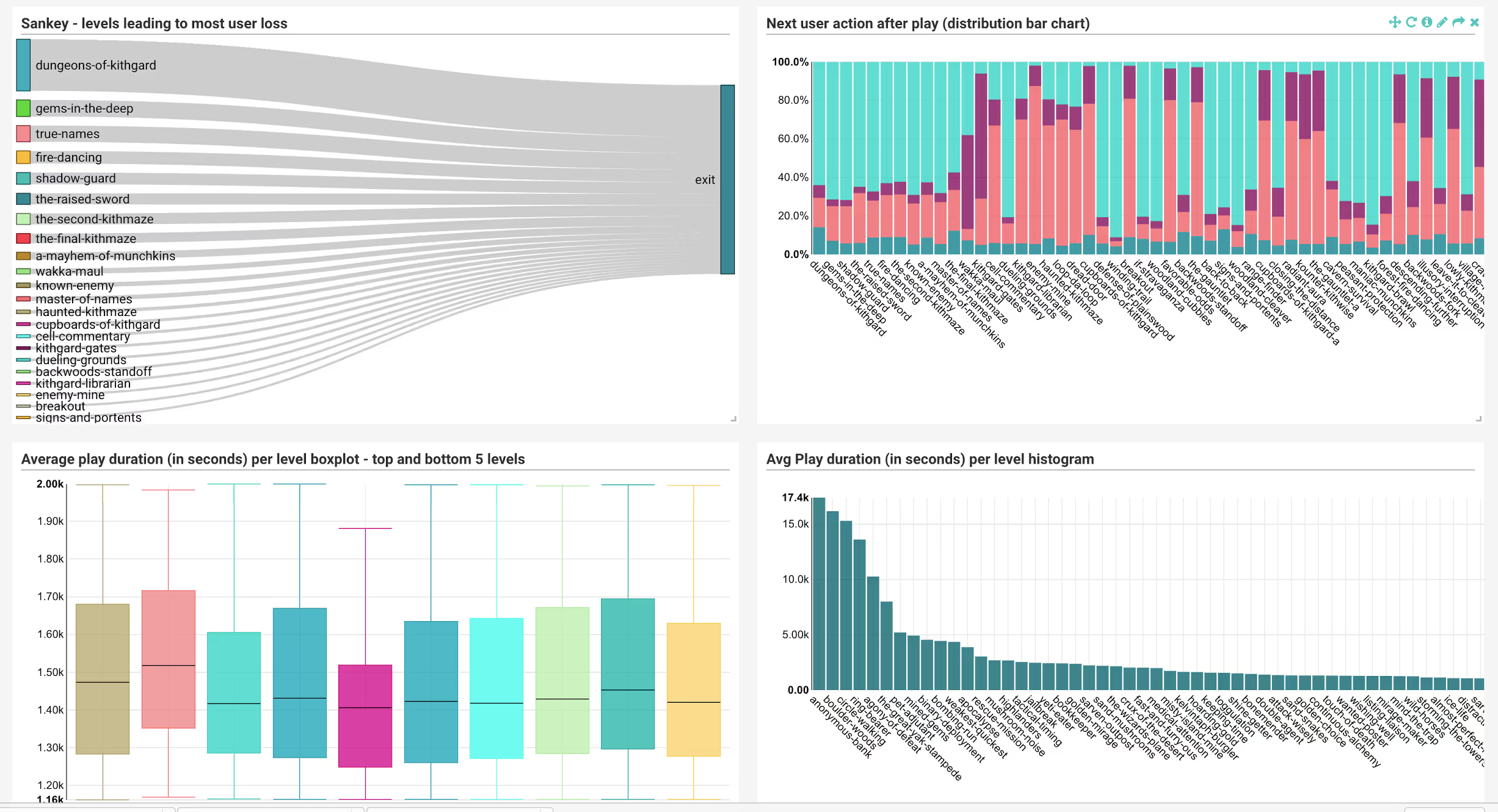
I was part of the team working on this demo for the GDC and in this post I’ll take you through some aspects of that demo, to show what Snowplow might enable a product manager to do. In an actual client project we can delve into even more detailed aspects of the game, as needed. The demonstration itself consisted of a number of dashboards we built using Superset, Airbnb’s open source dashboard tool. For product analytics, the most useful of these is the level analytics dashboard, which provides several visualisations of overview statistics to monitor the performance of each game level. Here are some screenshots.
Level analytics: gauging game difficulty
Let’s take a look at the ‘Level ratios’ table, and dive into some of the more interesting observations. To do this, I first filtered the dashboard to only show levels within the first world of the game. In this game, the first world is free-to-play, after which users hit a paywall to access the next world-stages. There are 21 mandatory levels, along with some optional ones that I haven’t included here for simplicity’s sake. Here’s what the filtered ‘Level ratios table’ looks like:
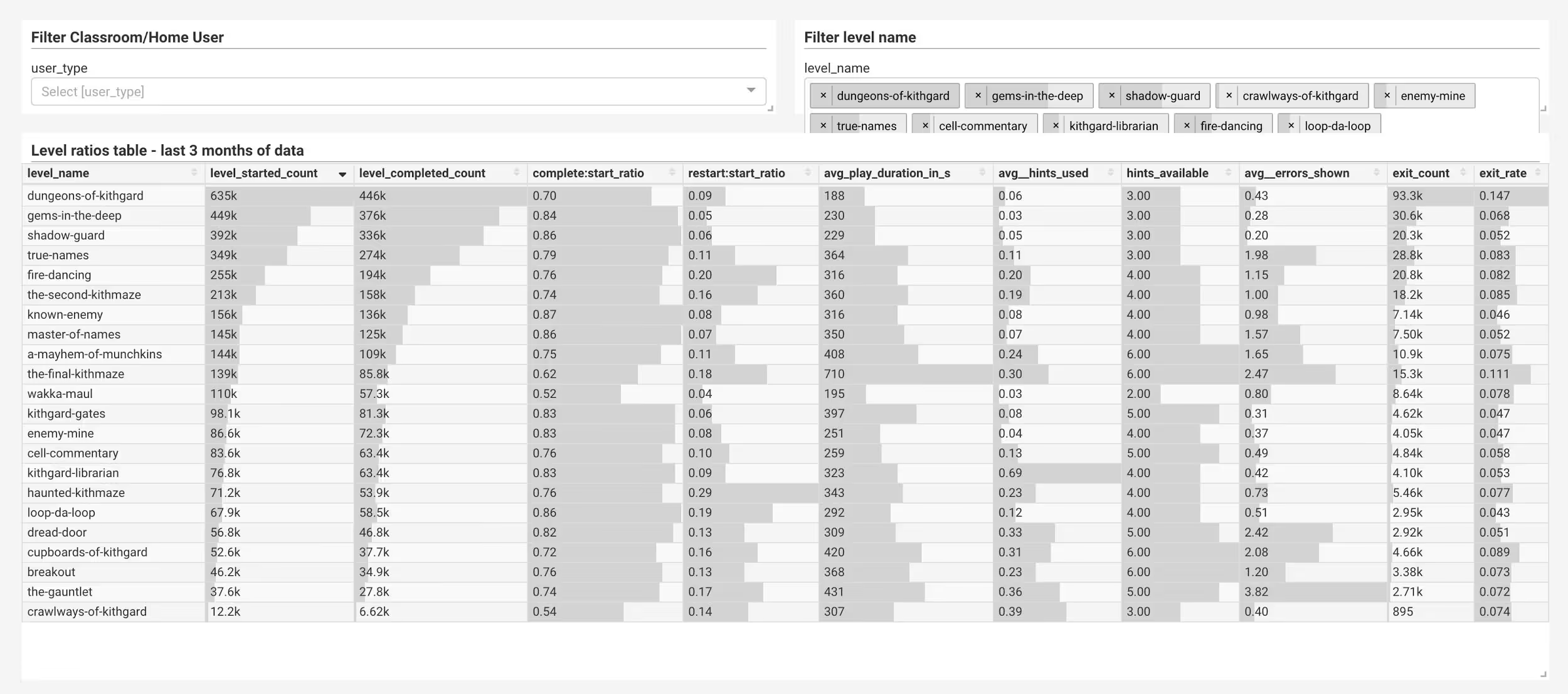
First off, the value of the first three columns - level starts, level completions and ratio of completion - are good guiding metrics for how the difficulty curve changes between levels, and whether this matches the intended design.
Exit rate: monitoring user engagement
Let’s have a look at another useful metric: exit rates. When a user plays a level, then leaves the game completely without returning, we defined it as an ‘exit’, and attribute the exit to that level. So an exit count of 2.54k for a level means that about 2,500 people left immediately after that level and never came back. For this demonstration we didn’t dig into cases where users browsed elsewhere in the website before leaving, as there weren’t enough of these cases to make a big difference to the demo. On a live implementation, this would be easy enough to do. When we sort the Level ratios table by exit rate (ie the proportion of exits to level starts), it looks like this:
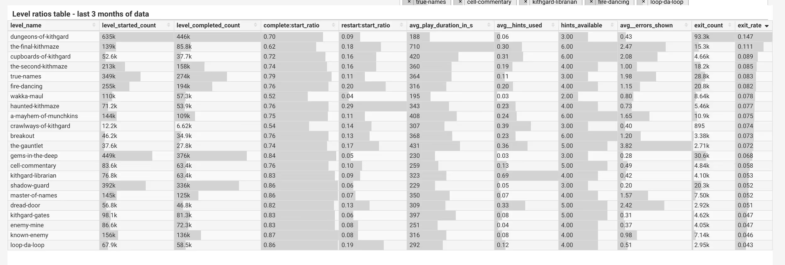
Immediately we see that the ‘Dungeons of Kithgard’ level has both a massive absolute exit count and exit rate. You might have guessed from the very high start count that this is the first level, so you would expect it to have the most exits - the game isn’t everyone’s cup of tea. By this logic you would expect the first 3 levels to have high exit rates, but in fact level 2 and 3 (‘Gems in the Deep’ and ‘Shadow Guard’) are 13th and 16th for exit rate respectively. They do account for a lot of absolute exits, but proportionally retain a good amount of their users. So already we see that the first few levels seem to be well designed in terms of keeping interested users’ engagement.
‘Shadow Guard’ appears to be a very well designed early level. It has a low absolute exit count despite high starts, low average play time, hints used, and average errors shown (an error is when the user types faulty code, that would produce an error if run in a real-life environment).
Looking at the other levels with high exit rates, the first thing that jumped out at me was that ‘The Final Kithmaze’, level 19, is second only to the first level for exit rate. We might assume that later levels lead to more exits (as users approach the paywall). This seems not to be the case in comparison with the previous level - ‘A Mayhem of Munchkins’ - and the next one - ‘Kithgard Gates’, which happens to have one of the lowest exit rates:
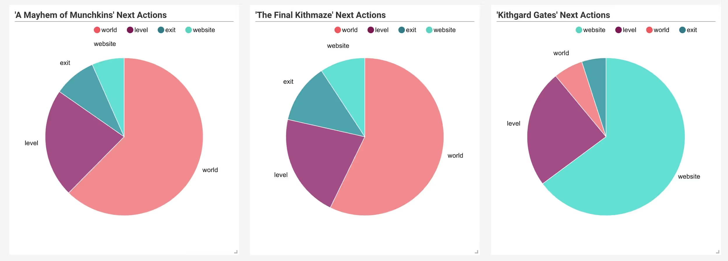
‘The Final Kithmaze’ is a maze level, as are level 11 - ‘The Second Kithmaze’ (4th for exits) -, and level 10 - ‘Haunted Kithmaze’ (8th for exits). These three maze levels appear to have a higher exit rate than the rest, accounting for about 34,100 users lost in the 3-month period. Tellingly, ‘The Final Kithmaze’ also has the highest average play time, and second highest average errors shown.
Upping your game and A/B testing hypotheses
From the looks of things, Maze levels are a cause of more user loss than the others. A product manager might want to look at testing some options from here, such as:
- making one or more of these levels optional
- changing the order of the levels
- changing the levels themselves
- incentivising these levels with in-game currency or achievements
The good news is that outcomes for all of these strategies are measurable, and with Snowplow’s at-source data processing, you can see the results of your A/B tests very fast and decide whether to roll out changes and new features. In fact, you can do it in real-time if you use our Real Time data pipeline, which mobile gaming companies like.
Delving into the user experience
With just some overview statistics, we have already identified that some types of levels seem to be leading to more user loss than others. Let’s exclude those types of levels, and see what else we can learn about the user experience and user loss.
Since this game offers a free trial for the first world, we might expect to see a group of users play a series of levels, then drop out as they decide it’s not for them, get distracted, or find the progression too difficult. We would expect this to start happening mid-way through the first world stage. Sorting the data by exit rate and ignoring maze levels, we see that there are a two good candidates between level
s 8-13: ‘Fire Dancing’ (level 8), and ‘Cupboards of Kithgard’ (level 13). The other levels between level 8 and 13 (‘Loop da Loop’ and ‘Dread Door’) have pretty low exit rates, coupled with low play times - so they look easy enough not to risk much user loss.
Now, with this game, we have two different types of user, and therefore two different types of user experience - individual users (home), and users that play as part of their lessons in school (classroom). When we filter the table by classroom users then sort by exit rate, we get the following result:

‘Cupboards of Kithgard’ is now the third from top candidate for exits, with ‘Fire Dancing’ 6th in the list. Comparing that to the same table, except displaying only home users, we get the following table:

We see that while ‘Fire Dancing’ is still at 5th, ‘Cupboards of Kithgard’ is now fifth from bottom for exits. Home users very seldom leave after this level, which would suggest that it’s something about the classroom user experience that leads to exits for this level, rather than the level itself. A likely explanation is that this is the point where the lesson tends to end. This is backed up by the fact that the sum of average playtime for the first 13 levels is around an hour.
Here, using Snowplow enabled dashboards, we have identified the two mid-game non-maze levels causing most user loss, and that ‘Cupboards of Kithgard’ appears to be a user-experience led loss, rather than game design led (although we may want to alter the product somehow to mitigate the loss of those classroom users that do leave). Again, we might want to test our options in both cases.
‘Fire Dancing’ seems to be a perfect storm of high enough difficulty and far enough into the game to lose a lot of users. Here are some options as to what we might do:
- Changing the order of levels
- Tweaking the level itself
- Incentivising users to attempt the next level
- Introducing a mandatory sign-up before this level, then reaching out to users who left (in order to retain those that simply didn’t think to bookmark the game)
Classroom users are likely to reach ‘Cupboards of Kithgard’ (level 13) in their first trial session. We might look into:
- Comparing those that do exit after this level with those that don’t. Are there features of user experience in the first 13 levels that predict user loss? (eg. high error counts)
- Test the introduction of a multiplayer level, or some other incentive to increase engagement for classroom users before they reach this point
Again, all of the above can be easily explored using the Snowplow pipeline, and changes can be A/B tested easily, quickly and cheaply.
Conclusion
These examples are just some quick summaries of what we can see from a cursory examination of summary statistics enabled by the Snowplow pipeline. The actual findings are specific to CodeCombat and as such an illustration of how a dashboard can help you improve your game. With Snowplow, you maintain ownership and control of your own data and can analyse it flexibly. So your analytics would be specific to your game, and in whatever level of abstraction or detail you need to gain insight into your product.

