Snowplow for media part 3: what can we do with the data when we're getting started?
N.B. We recommend you read the main post on this topic before diving into this article to ensure you have all the context you need!
Bear in mind there are two more posts in this series you can read after this one:
Do also read the post that answers the question: What should I track?
What can we do with the data when we have a small data team?
- Stitch user data: gain a 360° view
- Perform aggregations: make your own assumptions to understand engagement
- Retention analysis
- Marketing attribution
What can we do with the data when we have a small data team?
Here are five examples of what you can do with a treasure trove of Snowplow data and 1 analyst:
- Stitch user data: gain a 360° view
- Aggregate event level data: make your own assumptions
- Get a view of how well users are being retained
- Create a marketing attribution model
Let’s look at each in turn. Keep in mind, this is a non-technical run through, for more information on how to implement each of these ideas, please contact us or refer to relevant articles linked in each section.
1. Stitch user data: gain a 360° view
For all further analysis, we will want to know the touchpoints a user takes on any of your platforms or domains in order to build the richest understanding of their behaviour.
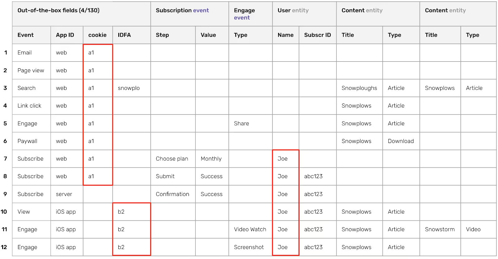
Snowplow facilitates this by giving you ownership of your event level data and tracking every event with a host of user identifiers. Let’s look back at the example for the first post on this topic before diving into this article to ensure you have all the context you need!), remember the data in your warehouse is all in one table (regardless of platform or domain) with one row per event. Each event is tracked with a series of cookies on the web (one of which is a cookie set against the collector domain which is not deleted by Safari due to ITP 2.1) and IDFA/IDFV/AAID on mobile along with any custom identifiers.

Events on the web can be back stitched to even before a user identified themselves as shown below:

Similarly on mobile (note app installs can be tracked as Snowplow events using Adjust):

Snowplow Co-Founder Yali Sassoon covers the Snowplow approach to user stitching more thoroughly in this blog post. He then dives into the deeper “how-to” in this blog post.
The output is that you can query your events table by user ID and see a whole list of events performed by that user across all platforms, devices and domains – including events before they identified themselves. This sets us up nicely for the next step.
2. Perform aggregations: make your own assumptions to understand engagement
The power of having a table full of unopinionated event level data lies in making meaningful assumptions. Having rows of event level data will hardly drive business value on their own so it is time to decide how to aggregate the data.
If the analysis you want to perform is on retention you’ll likely aggregate events by session; if it is on donation or subscription behaviour you may aggregate events leading up to a donation or subscription respectively. You can choose what you want to group events by since the tracking you set up is designed by you.
2.1. Event level table
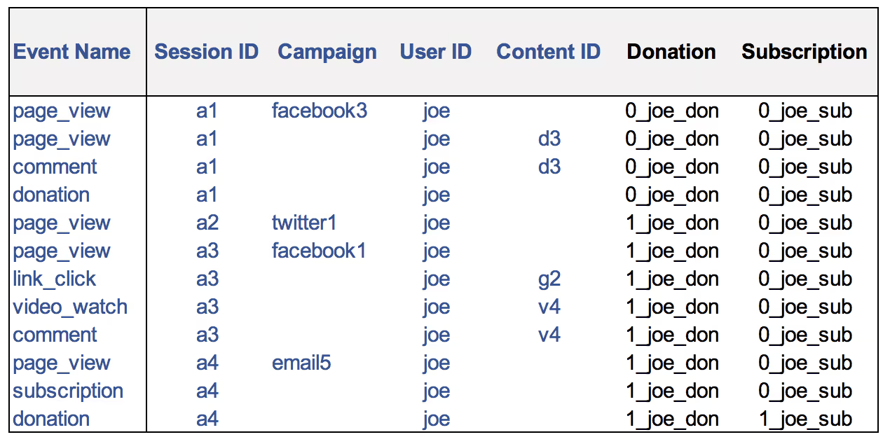
For simplicity, let’s start off by looking only at a few columns of event level data (as delivered by Snowplow into your data warehouse) sorted by timestamp (raw data in blue). The “Donation” and “Subscription” columns are derived to assign a common value to all events that occur between donation and subscription events respectively (we will aggregate using these values later).

2.2. Session and conversion level table
Now we can roll this event data up by conversion (donations and subscriptions) and session to get meaningful numbers. The data in these tables all comes from the previous table (timestamps aside). Note that every web and mobile event is collected with a session ID (you can configure what the definition of a session is at the tracker level).


2.3. Content engagement table
Content engagement can also be aggregated since any engagement events are collected with a content ID. This data all lives in your cloud warehouse so can be joined to backend data via content ID. Snowplow also collects configurable heartbeat events, page pings (not shown in events table above for cleanliness), which allow for scroll depth calculations and accurate “time engaged” calculations allowing you to gauge how long a user spent reading content and how far down they scrolled before clicking away.
Accurate measurement of these key metrics can promote content with high engagement as opposite to that with high reach. Weighted engagement scores can be created and updated using the event level data to be able to deliver summary level data to senior management. Below is a table for articles on a fictional news site.

2.4. User level table
A lot of actionable insight will actually come from rolling these tables up to a user level. I have added some other example user data here for comparison.

As a Snowplow customer, we will be happy to enable an example SQL data model that we have built that does a simple version of this for you. Since you have full ownership of any modelling, you have full confidence in what assumptions were made to surface results and have the full power to tweak those assumptions.
Snowplow customers can be set up for free with Redash or Superset, both BI tools that allow you to build compelling dashboards from the tables you create. Many Snowplow users send data to Looker and use that to socialise Snowplow data through their business.
This kind of model can form the skeleton from which some of the following questions may be answered:
- Which content is most popular (separate lists based on time engaged, scroll depth, views)?
- What type of user looks at what type of content?
- Which users bring the most lifetime value?
- Which content encourages users to digest more and return?
- If there are multiple sites/brands, are users active across multiple sites/brands? (all events are sent with a 3rd party cookie that allows to identify a user across multiple domains)
- Which ads are users seeing and clicking on?
The example tables shown above are quite basic and are intended as an illustration of what a starting point may look like.
3. Retention Analysis
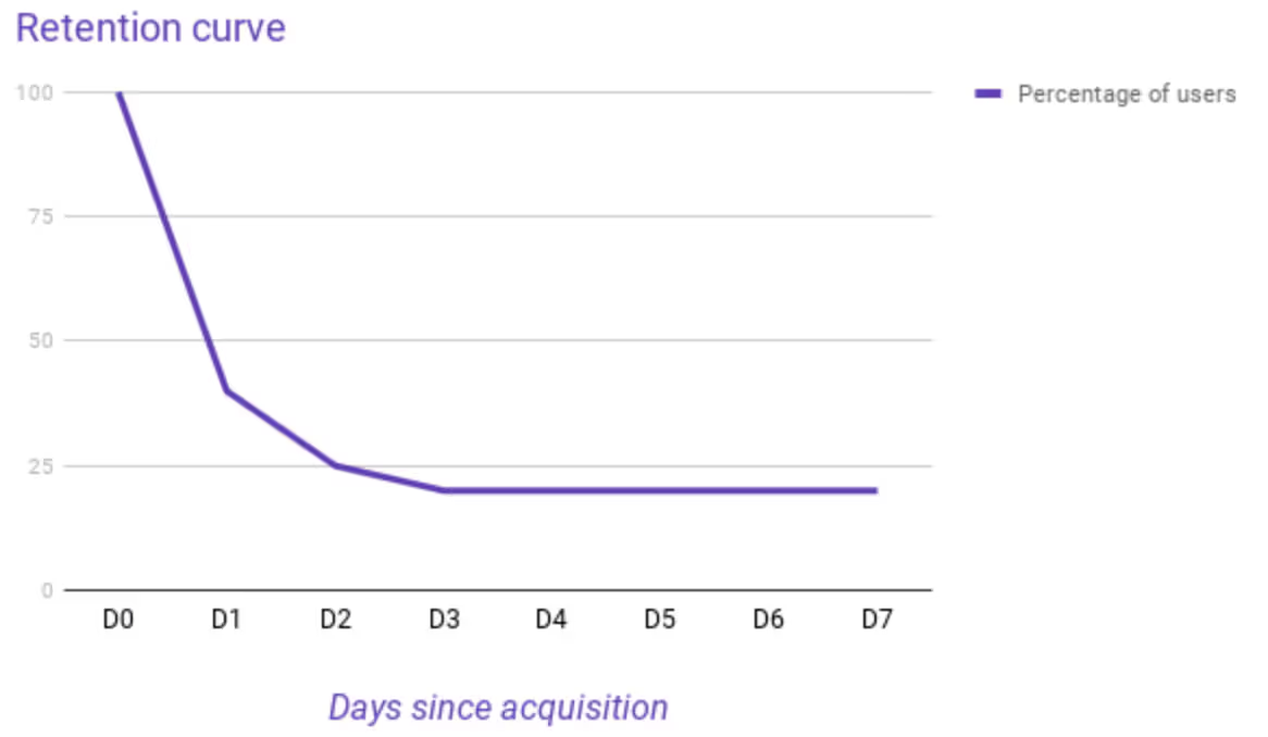
It is good to know at the outset whether your product suffers from retention issues. To do this, simple retention plots can be built on using the tables shown in the previous section. This analysis often surfaces low hanging fruit for what product actions you can take to drive retention.
You can find a case study on how Snowplow-user Lifecake drove retention using event level data. I’ve added a diagram from his blog post below to get an idea of what is in the case study.

In summary, Snowplow’s rich event-level data is great for understanding the drivers of retention since you can observe individual user paths to see each users’ engagement with your product.
Snowplow’s Head of Professional Services, Christophe, gave a great talk on this topic at a Snowplow meetup.
4. Marketing attribution
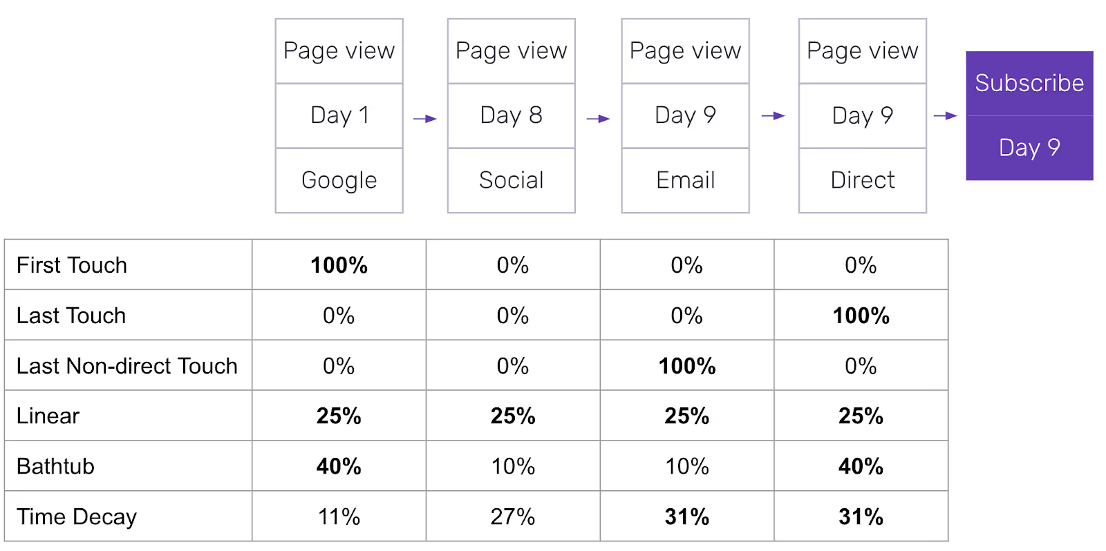
A quick win for getting a return on investment on building a data capability is to optimise marketing spend. Based on the tables we have already built in the previous sections, a set of coefficients can be applied as a starting point for an attribution model.
Having access to the underlying data means that you can assess which attribution model would work best for you by exploring your data. You don’t have to rely on out of the box, one-size-fits-all models, you can build a custom one.
Some commonly used examples are as follows:

Remember, the model can include micro-conversions too such as shares on social media or clicks on advertising content.
The great thing about having the underlying data is that with time, you can update and refine this model as more and more data comes in.
Read next: What can we do with the data, now we’re growing
Learn more about our unique approach to data delivery with a Snowplow demo.

