Using Snowplow for marketing data analytics
The first step towards solving a problem is admitting one exists. And I have a lot of problems. As marketing professionals, we all do: which projects are highest priority, how many leads did we generate this month, did we publish a blog post yet this week, and so on.
The fundamental goal of marketing is to support organizational growth. Whether you’re a retailer looking to boost sales, a B2B SaaS provider trying to increase lead generation, or a charitable organization trying to raise awareness for a social issue, you’re trying to help move the needle in a positive direction around an institutional goal.
In the past the success of your efforts was judged against a positive correlation with that business goal: if we produced a radio commercial and saw more sales in the same month, it must have worked. Technology has changed everything.
Today in the world of digital marketing, not only do we have the ability to more accurately track the direct performance of a given marketing campaign, we have the responsibility to do so. Marketing success has transformed from a given into a set of complicated, multi-layered questions to which the answers are not always clear. Despite the complexity and ambiguity, it is expected of marketing teams to be able to provide answers, in great detail, to as many of these questions as possible.
How effective was our last Facebook ad at increasing sales? How many new members have we gained since we posted that blog? Is it worth having a Twitter profile- is it really generating new business for us? Ultimately, it all boils down to is our marketing working?
The right data comes from the right questions
That’s one of the questions I ask myself every day when I look at where Snowplow fits in the vast digital analytics landscape. In an industry full of complicated technologies and hyper-intelligent people, are we providing useful resources? Is our blog, our newsletter, our social media something that will add value to our audience? These are the questions I have to ask myself in order to uncover and understand if our marketing is truly working.
Initially, I tried to confine my answers within the metrics I was accustomed to: new vs returning users, daily and weekly page views, most popular landing pages, and referral sources (to name a few). But it’s only recently, now that I’ve become more familiar with Snowplow’s style of event-level data, that I was able to start asking the really interesting questions. For us at Snowplow, one of those interesting questions has been, “How effective is our content at driving interest and sign ups to our paid product?”
Is our content effective at all?
Before we can understand how effective our content is, I have to establish that it’s actually working. Because Snowplow lets us track a user’s journey from end to end, from the first time they visit our website to the moment they (hopefully) sign a contract with us, we are able to look at a macro view of these journeys across different sections of our website. This lets us see, clearly, how many visitors convert to leads and ultimately users without having to assume that if there’s more content and more leads, the content must be working.
Our blog comes in at number six in terms of lead generation:

Source:
WITH prep AS (
SELECT


    a.company,
    a.domain_userid__c,
    a.convertedopportunityid,
    b.name AS accountname,
    c.name AS servicecontract,
    CASE WHEN e.name IN ('Managed Service - Batch', 'Snowplow BDP - Batch','Managed Service - Real-Time', 'Snowplow BDP - Real-Time','Snowplow BDP - Enterprise','Support') AND d.poc__c IS NOT TRUE THEN e.name ELSE null END AS recurring_contract,
    d.poc__c


FROM salesforce.sf_lead AS a

LEFT JOIN salesforce.sf_account AS b
ON a.convertedaccountid = b.id

LEFT JOIN salesforce.sf_servicecontract AS c
ON c.accountid = b.id

LEFT JOIN salesforce.sf_contractlineitem AS d
ON c.id = d.servicecontractid

LEFT JOIN salesforce.sf_pricebookentry AS e
ON d.pricebookentryid = e.id

WHERE a.isdeleted IS NOT TRUE
AND b.isdeleted IS NOT TRUE
AND c.isdeleted IS NOT TRUE
AND d.isdeleted IS NOT TRUE
AND e.isdeleted IS NOT TRUE
AND a.name NOT IN ('Christophe Bogaert','Yali Sassoon', 'Test Test', 'rg fg','C C', 'test', 'Test','snowplow', 'test case','Z Y','fds dsf')

GROUP BY 1,2,3,4,5,6,7
)

SELECT

    --TO_CHAR(DATE_TRUNC('month', page_view_start),'YYYY-MM-DD')  AS "month::filter",
    page_url,
    COUNT(*) AS page_views,
    COUNT(DISTINCT user_snowplow_domain_id) unique_users,
    COUNT(DISTINCT CASE WHEN session_index = 1 THEN user_snowplow_domain_id END) AS new_users,
    COUNT(DISTINCT CASE WHEN page_view_index = 1 THEN user_snowplow_domain_id END) AS new_users_first_page,

    COUNT(DISTINCT CASE WHEN domain_userid__c IS NOT NULL THEN user_snowplow_domain_id END) AS new_lead,
    COUNT(DISTINCT CASE WHEN recurring_contract is not null THEN user_snowplow_domain_id END) AS mrr


FROM derived.page_views AS a

LEFT JOIN prep AS b
ON a.user_snowplow_domain_id = b.domain_userid__c

WHERE referer_url NOT IN ('webto.salesforce.com/servlet/servlet.WebToLead','webto.salesforce.com/','www.salesforce.com/servlet/servlet.WebToLead','www.salesforce.com/')

GROUP BY 1
ORDER BY 7 DESC
Being able to query across all of this data lets me see which pages are doing the most work for us bringing in new customers. (It’s also important to look at data like this to identify sections of our website that are either performing below expectations or are surprisingly effective at converting visitors.) This table validates that our blog is generating some leads, but the question I want to answer is how effective is that content- is sixth place good for our blog? Or can it do better?
How effective is our content at driving interest and sign ups to our product?
Looking at the URL conversion rates, we can learn a lot about how the blog is performing compared to other parts of our website. Of the 108,845 pageviews on the home page, 862 leads were generated (about .79%) and of those leads, 31 became customers (about 3.59%). On our blog, however: the 16,244 pageviews on our blog generated 203 leads (1.25%), and of those leads 15 became customers, amounting to 7.38% of the leads. Looking at a different metric, NEW_USERS_FIRST_PAGE, we can see of the page views, how many were new visitors to our site and what their landing page was. The 862 leads generated by the homepage were 1.37% of the 63,044 new, first time users; compare that with the 39% of our blog’s 519 new, first time users and we have evidence to suggest that our content is effective at driving interest and sign ups to our paid product.
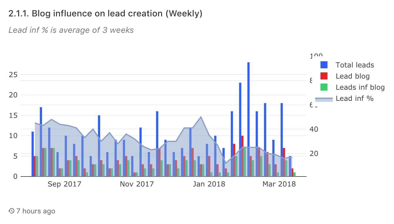
Understanding the relationship between content and lead generation is multi-faceted and complex with many different methodologies for joining these two together. How you connect this data becomes a component of your attribution model (we’ll look at attribution modeling more in a future post). With a working version of an attribution model, we can use that to compare the number of leads that are attributed to a blog post we’re generating on a weekly basis with the overall total number of leads to get an idea of our blog’s impact, called lead influence percentage.

This graph shows that as our volume of leads increases, the blog influence percentage decreases, a conclusion that seems counterintuitive to the conclusion about our blog’s conversion rate. Our next step is to closely analyze our leads from the past two months, as well as going forward, to understand the impact our content has, identify the positive effects, and eventually scale them.
Is our blog accomplishing its goal?
When I first started working for Snowplow, we came up with a hypothesis: if our blog provides education, resources, and thought leadership around digital analytics, event-data modeling, and the business benefits of a sophisticated data stack and culture, then our content will drive traffic and leads. If we’re successful along these vectors, we expect to see the several metrics move including percentage of traffic from external sources and social referrals, increases in newsletter subscriptions, and increases
in overall site traffic over a longer time horizon.
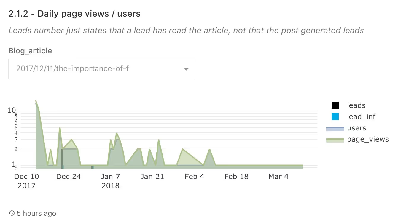
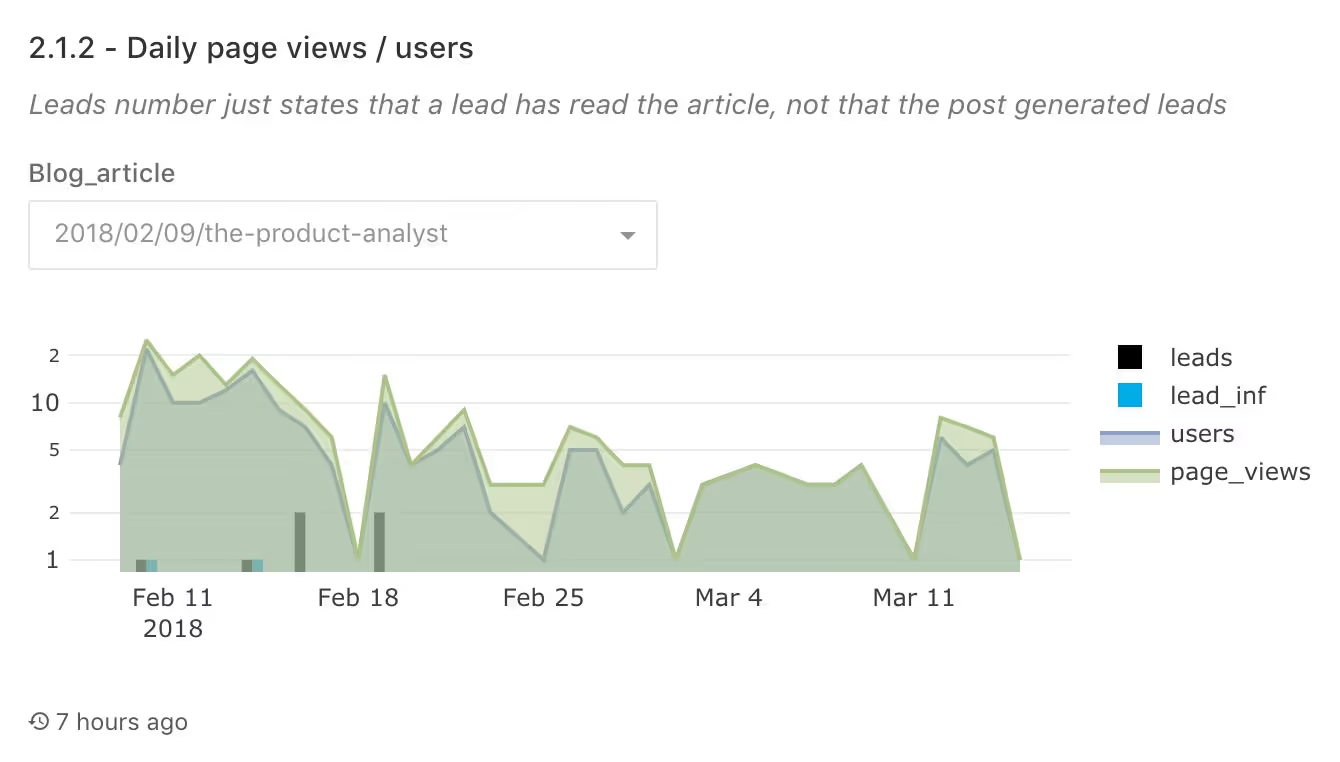
One way we benchmark if this is to determine how evergreen our content is, or how well it retains its value. A post on basic analyses any product analyst can use provides immediate value, and will still be relevant to readers looking to learn more about product analytics six months after publishing. Contrast this with a technical release post which sees almost no readership after the next release, or a post following a major event company event or conference which decreases exponentially.

This is our viewership on a blog post after a company event. As expected, it shows a big spike in traffic after publication followed by a sharp decrease. Over time, it’s received a modest amount of views, but with most of them coming from the initial post date, it’s unlikely we’ll see traffic to this post increase much going forward. Evergreen content covers topics that will frequently be top of mind or are essential to digital analytics professions, attracting new readers over time. The blog post mentioned on product analytics graphs much closer to what we want our blogs to look like:

How do we improve our content’s effectiveness?
The viewership on our product analytics piece suggests we’re moving in the right direction, but there are still a lot of unanswered questions. With these performance benchmarks gathered over the previous months, we can compare to the next three months and have a much better understanding of what content is the most useful and appreciated by our audience.

